A call option payoff diagram helps you see risk before you place a trade. This article shows how profit and loss change at expiration, how the call option profit formula links to a call option graph, and why long call payoff and breakeven matter. We will reference an Excel template, which you can download at the bottom of this article and use through our Excel add-in.
KEY TAKEAWAYS
A call option payoff diagram shows how profit and loss change at expiration as the stock price moves.
The buyer has limited risk and unlimited upside, while the seller has limited profit and high risk
Breakeven comes from strike and premium, and it is the key level to read on the call option payoff diagram. You can use our Excel template to compare the long call and short call option payoff diagrams.
How a Call Option Payoff Diagram Works at Expiration
A call option payoff diagram shows profit and loss only at expiration. That matters because, at that point, time is gone and price is the only thing that counts. This strips the trade down to its core and makes outcomes easier to judge.
On the charts below, the X-axis is the underlying price at expiration, while the Y-axis is profit or loss.
Once you see that layout (which is the same you’d see on our options screener), reading a call option graph becomes straightforward. Here are the key pieces behind the picture:
Strike price, the level where the call starts to gain intrinsic value
Option premium, the amount paid or received upfront
Intrinsic value, how much the option is in the money at expiration
Using these inputs, the call option profit formula turns prices into dollar outcomes. That is why the long call payoff looks flat below the strike and rises above it. Loss is limited to the premium, while profit grows as price moves higher.
Call option payoff diagrams make comparisons easy. You can line up different strikes or switch between long and short calls and instantly see how risk and reward change, without guessing or running scenarios in your head.
Understanding Profits, Losses, and the Call Option Profit Formula
The numbers behind a call option payoff diagram are simple once you understand intrinsic vs extrinsic value in options and write them down. In fact, here’s a table that recaps the math:
Position
Call option profit formula at expiration
Maximum profit
Maximum loss
Breakeven price
Long call
Intrinsic value - premium paid
Unlimited
Premium paid
Strike price + premium
Short call
Premium received - intrinsic value
Premium received
Unlimited
Strike price + premium
For a buyer, the call option profit formula is intrinsic value minus the premium paid. If the option expires out of the money, intrinsic value is zero and the result is a loss equal to the premium. That same math explains why the long call payoff has limited risk and open upside.
For the seller, the formula flips. Profit is the premium received minus intrinsic value at expiration. If price stays below the strike, intrinsic value is zero and the seller keeps the full premium. If price rises, losses grow as intrinsic value increases, which is why the short call looks risky on a call option graph.
Key outcomes fall straight out of the formulas:
Maximum loss for a long call is the premium paid
Maximum profit for a short call is the premium received
Long call profit grows as price moves above the strike
Breakeven is where intrinsic value equals the premium. For a call, that price is strike plus premium. This level matters because it is the point where the call option payoff diagram crosses from loss to profit, making it a key reference before placing any trade.
Reading a Call Option Graph for Long and Short Positions
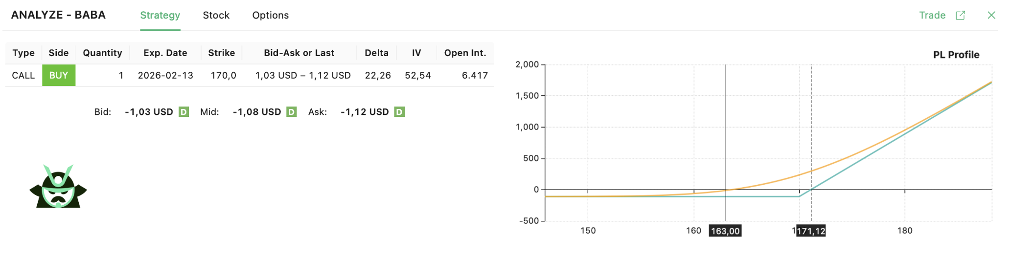
On a call option payoff diagram, the long and short sides mirror each other (much like a put option payoff diagram mirrors its own long and short sides."). Start with the long call (this is an example from BABA):
You can see this from the chart above: below the strike price, the line is flat and negative. The option expires worthless and the loss is limited to the premium. Once price moves above the strike, the line turns upward. This is where the long call payoff begins to grow as the stock rises.
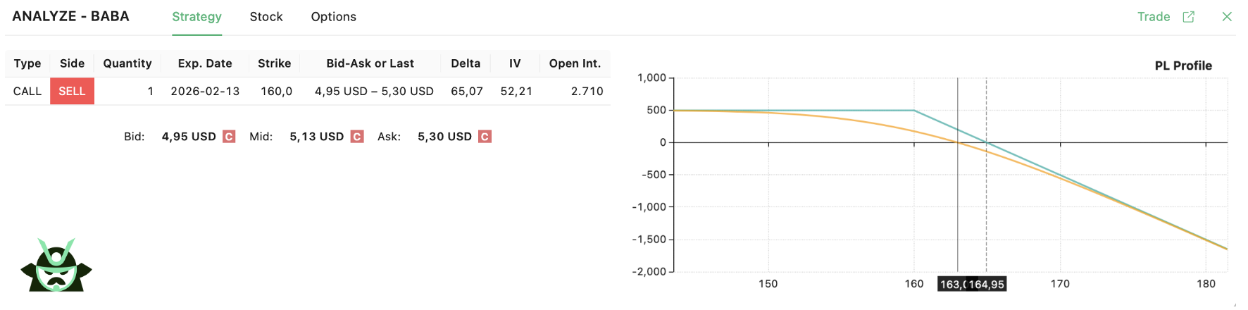
Now let’s take a look at a short call option payoff diagram on the same ticker:
The short call shows a flat, positive line below the strike. The seller keeps the premium as long as the option expires out of the money. Above the strike, the line slopes downward. Losses increase as price rises, which is why the short call carries open risk on a call option graph.
A few simple rules help when reading the chart:
The kink in the line always sits at the strike price
Moving the strike shifts that kink left or right
Changing the premium moves the whole payoff line up or down
The call option profit formula explains these shifts. Higher premiums raise the seller’s payoff and deepen the buyer’s loss at expiration. One final note on that orange line you can see in the images above: this is the P&L of your position today, which is calculated via the Black & Scholes model. As time goes by, that orange line will gradually move closer and closer to the blue one. Implied volatility (IV) is also a factor to consider: an increase in IV will either benefit your position (if you are a buyer) or hurt it (if you are a seller), moving the orange line up or down.
Breaking Down the Long Call Payoff and Its Risk Profile
Traders usually choose a long call when they expect the price to rise but want to cap their downside. The trade risks a fixed amount, the premium, while keeping upside open. This balance is easy to see on a call option payoff diagram, which lays out every possible outcome at expiration.
Below the strike price, the option expires worthless. On the chart, this shows up as a flat line at a loss equal to the premium. Nothing changes no matter how far the price falls. At the strike, intrinsic value is still zero, so the result is the same fixed loss. This is why the long call payoff is often used instead of buying stock when risk needs to be controlled.
Once price moves above breakeven, the picture changes. Breakeven sits at strike plus premium. Past that level, profit grows as price rises, following the slope shown on the call option graph. The call option profit formula explains this move, intrinsic value increases dollar for dollar with price.
In short, outcomes break down like this:
Maximum loss is the premium paid
Unlimited upside above breakeven
A clear profit threshold visible on the call option payoff diagram
This clarity is what makes long calls easy to evaluate before entering a trade.
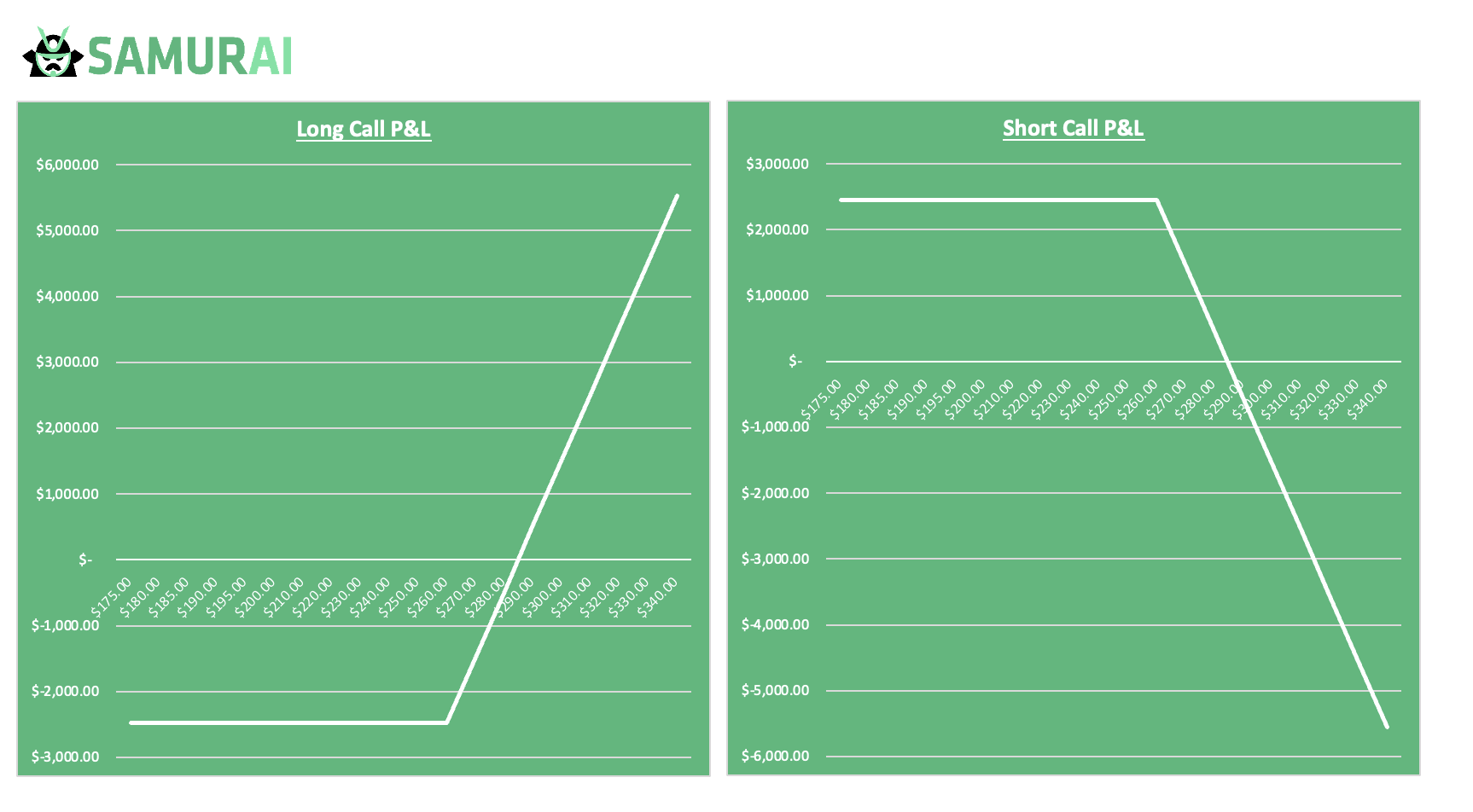
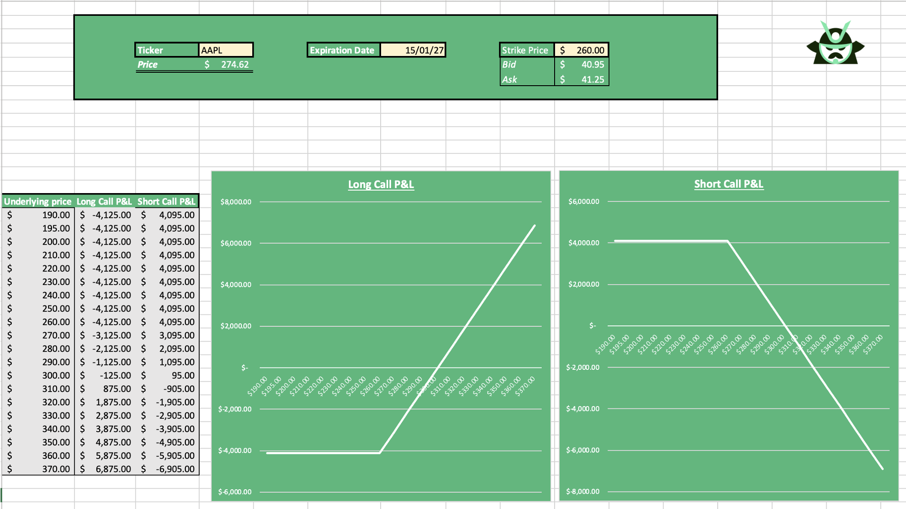
A Practical Example Mapping Numbers to the Call Option Payoff Diagram
Take a simple case on our Excel template. Set the ticker to AAPL, the expiration date to January next year, and select a 260 call. With just these inputs, the template builds the full picture at expiration:
Once entered, the call option graph shows how profit and loss change as price moves. Below the strike, the long call payoff is a flat loss. Above the strike, profit rises with price. The call option profit formula runs in the background, but you do not need to calculate anything manually.
The same setup also displays the short call side:
Long call P&L with limited downside
Short call P&L with limited upside
By changing only the strike price, the call option payoff diagram updates instantly. This makes it easy to compare outcomes and understand risk before placing the trade.
Gianluca Longinotti is an experienced trader, advisor, and financial analyst with over a decade of professional experience in the banking sector, trading, and investment services.
Leav Graves is the founder and CEO of Option Samurai and a licensed investment professional with over 19 years of trading experience, including working professionally through the 2008 financial crisis.
 Gianluca LonginottiFinance Writer - Traders Education
 Leav GravesCEO