Put Option Payoff Diagram - Learn the Shape of a Put Option Trade
Published on March 23, 2026 | 7 min readTable of Contents
- Key Takeaways
- How a Put Option Payoff Diagram Works at Expiration
- Understanding Profits, Losses, and the Put Option Payoff Formula
- Reading a Put Option Graph for Long and Short Positions
- Breaking Down the Long Put Payoff Diagram and Its Risk Profile
- A Practical Example Mapping Numbers to the Put Option Payoff Diagram
- Read More
Reviewed by Leav Graves
Table of Contents
- Key Takeaways
- How a Put Option Payoff Diagram Works at Expiration
- Understanding Profits, Losses, and the Put Option Payoff Formula
- Reading a Put Option Graph for Long and Short Positions
- Breaking Down the Long Put Payoff Diagram and Its Risk Profile
- A Practical Example Mapping Numbers to the Put Option Payoff Diagram
- Read More
A put option payoff diagram shows you exactly what you stand to gain or lose at expiration, depending on where the stock ends up. This article covers how the put option graph works, how to use the put option payoff formula for both buyer and seller, and what the long put payoff diagram actually looks like. We also have an Excel template you can download to build your own put option payoff diagram.
KEY TAKEAWAYS
- A put option payoff diagram shows how profit and loss change at expiration as the underlying price moves
- The buyer of a put has limited risk and increasing profit as price falls, while the seller has limited profit and higher downside risk
- Breakeven comes from strike and premium, and it is the key level to identify on the diagram. Our Excel template lets you visualize both long put and short put payoff diagrams.
How a Put Option Payoff Diagram Works at Expiration
A put option payoff diagram shows profit and loss at expiration only. At that point, time value has disappeared and the stock price is the only thing that matters. This makes it easier to judge whether a trade makes sense before you enter it.
The axes work like this: the X-axis shows the underlying price at expiration, and the Y-axis shows profit or loss in dollars:
Three inputs drive everything you see on the put option graph:
- Strike price, the level below which the put starts gaining intrinsic value
- Option premium, the amount paid or received upfront
- Intrinsic value, how much the option is in the money at expiration
With a put, the direction is reversed compared to a call option payoff diagram. The long put payoff diagram slopes upward as price falls, not as it rises. Above the strike, the option expires worthless and the loss is capped at the premium paid. Below the strike, intrinsic value builds and profit grows.
This is what makes the put option payoff formula useful. It converts any expiration price into a clear dollar outcome, so you do not need to think in probabilities or run mental scenarios. The put option payoff diagram does that work visually.
It also makes protection easier to evaluate. If you hold a stock and want to hedge, the long put payoff diagram shows you exactly where your downside stops, and what that protection costs. That tradeoff, premium paid versus loss avoided, is visible at a glance.
Understanding Profits, Losses, and the Put Option Payoff Formula
Here is the math behind the put option payoff diagram, summarized in a table before we break it down:
Position | Put option payoff formula at expiration | Maximum profit | Maximum loss | Breakeven price |
Long put | Intrinsic value - premium paid | Strike price - premium | Premium paid | Strike price - premium |
Short put | Premium received - intrinsic value | Premium received | Strike price - premium | Strike price - premium |
For the buyer, the put option payoff formula is intrinsic value minus the premium paid. If the stock expires above the strike, intrinsic value is zero and the loss equals the premium. If price falls below the strike, intrinsic value grows and so does profit. Maximum profit is capped at the strike minus the premium, since a stock can only fall to zero.
For the seller, the formula flips to premium received minus intrinsic value. As long as the stock stays above the strike, the seller keeps the full premium. If price drops, losses increase as intrinsic value rises, which is what makes the short side look risky on a put option graph.
Keep in mind these ideas from the long put payoff diagram:
- Maximum loss is the premium paid
- Maximum profit is strike price minus premium paid
- Breakeven sits at strike price minus premium
That last point matters in real decisions. Breakeven is where the put option payoff diagram crosses from loss to profit. If you buy a put with a $100 strike and pay $5, you need the stock below $95 at expiration just to start making money. Knowing that number before you trade changes how you evaluate whether the position is worth taking.
Reading a Put Option Graph for Long and Short Positions
On a put option payoff diagram, the long and short sides are mirror images. Here is what each one looks like using MSFT as an example. These charts come directly from our advanced screener for options traders.
Starting with the long put option graph:
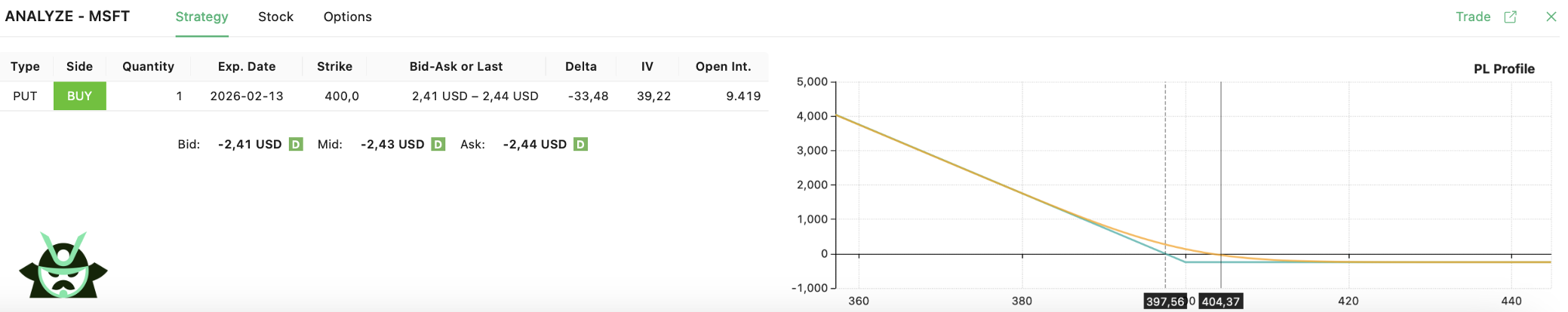
Above the strike, the line is flat and sits below zero. The option expires worthless and the loss is fixed at the premium paid. Once price drops below the strike, the line starts moving upward, and profit grows as the stock falls. This is the shape that defines the long put payoff diagram.
Now flipping to the short put:
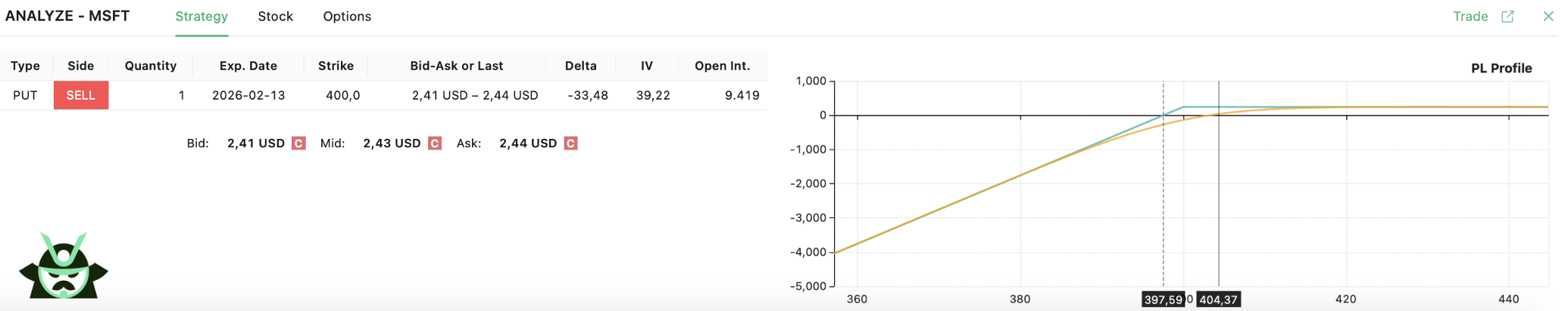
Above the strike, the line is flat and positive. The seller keeps the premium as long as the stock stays there. Below the strike, the line slopes downward and losses build as price drops. Unlike the buyer, the seller has no floor below the strike other than the stock hitting zero.
A few rules that make reading any put option graph easier:
- The kink in the line always sits at the strike price
- Moving the strike shifts that kink left or right on the chart
- Changing the premium moves the entire payoff line up or down
The put option payoff formula explains these shifts directly. A higher premium deepens the buyer's starting loss and raises the seller's starting gain.
One thing worth noting: the payoff diagram at expiration is the blue line. The orange line you see in the chart is today's P&L, calculated using the Black-Scholes model. As expiration gets closer, the orange line converges toward the blue one. Implied volatility also moves that orange line, up if you are a buyer and down if you are a seller. Neither time nor volatility show up in the expiration diagram itself, which is exactly why the put option payoff diagram is useful for cutting through the noise. This is also what sets a standard contract apart from an asian option, where the payoff depends on an average price rather than a single expiration value.
Breaking Down the Long Put Payoff Diagram and Its Risk Profile
If we exclude multi-let setups, traders buy puts for two reasons: they expect the stock to fall, or they want protection on a position they already hold. Either way, the long put payoff diagram shows the same shape, and it makes the risk easy to evaluate before placing the trade.
Here is how outcomes break down at expiration:
- Above the strike, the option expires worthless. The loss is fixed at the premium paid, no matter how high the stock goes. On the long put payoff diagram, this is the flat line sitting below zero.
- At the strike, intrinsic value is still zero. Same result, full premium lost.
- Below breakeven, the put option payoff formula kicks in and profit starts building. Breakeven is the strike minus the premium, and every dollar the stock drops below that level adds a dollar of profit.
Maximum profit is not unlimited here, unlike a long call. A stock can only fall to zero, so the most a long put can return is the strike price minus the premium paid. That is still a large potential gain relative to the premium risked, which is what makes the long put graph attractive for bearish trades.
To summarize the risk profile:
- Maximum loss: premium paid
- Maximum profit: strike price minus premium paid
- Breakeven: strike price minus premium
The put option payoff diagram makes all of this visible at a glance. You can see the exact price where the trade starts working, what you risk if you are wrong, and how much you stand to gain if the stock drops hard.
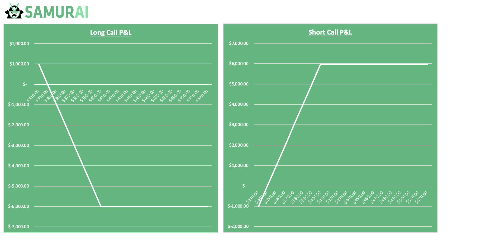
A Practical Example Mapping Numbers to the Put Option Payoff Diagram
Take our Excel template and set the ticker to TSLA, the expiration date to January next year, and select a $400 put. With just these inputs, the template builds the full picture at expiration:
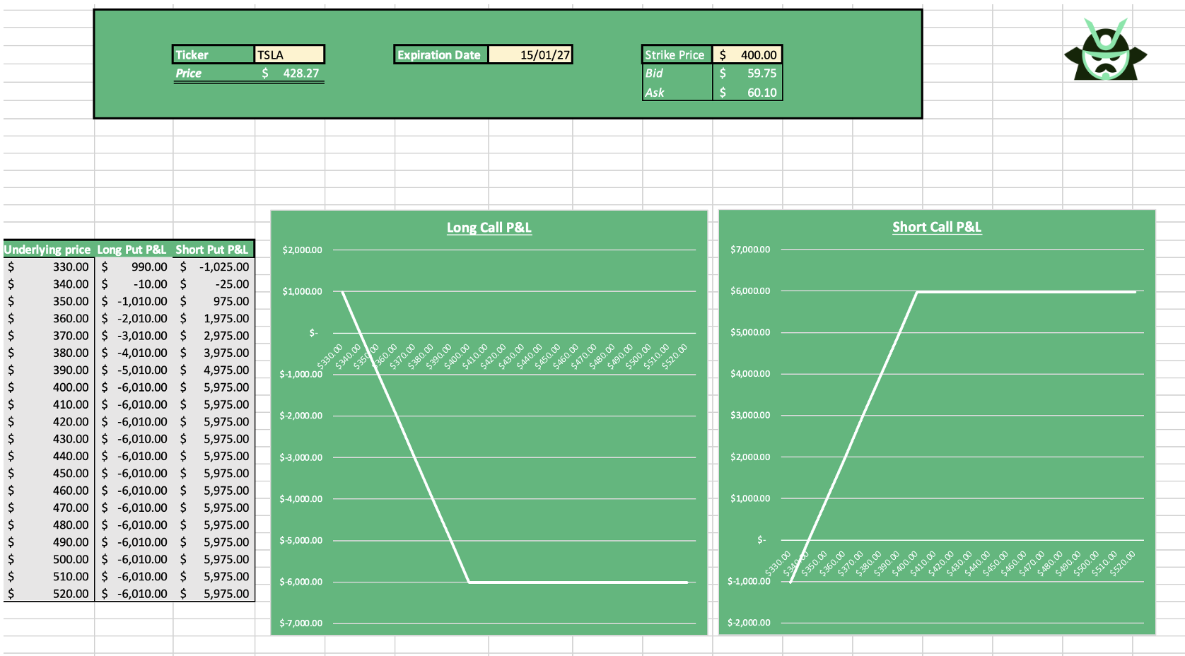
Once entered, the put option graph shows how profit and loss change as price moves. Above the strike, the long put payoff is a flat loss. Below the strike, profit rises as price falls. The put option payoff formula runs in the background, but you do not need to calculate anything manually.
The same setup also displays the short put side:
- Long put P&L with limited downside
- Short put P&L with limited upside
By changing only the strike price, the put option payoff diagram updates instantly. This makes it easy to compare outcomes and understand risk before placing the trade.
Read More
AUTHOR
 Gianluca LonginottiFinance Writer - Traders Education
Gianluca Longinotti is an experienced trader, advisor, and financial analyst with over a decade of professional experience in the banking sector, trading, and investment services.
REVIEWER
 Leav GravesCEO
Leav Graves is the founder and CEO of Option Samurai and a licensed investment professional with over 19 years of trading experience, including working professionally through the 2008 financial crisis.