Table of Contents
- Key Takeaways
- Understanding the Santa Claus rally
- Average S&P 500 performance during the Santa Claus rall
- Year to date performance vs Santa Claus rally performance
- VIX level before the Santa Claus rally
- Does the Santa Claus rally help predict the following year?
- Running the Santa Claus rally analysis on individual tickers
- Read More
Reviewed by Leav Graves
Table of Contents
- Key Takeaways
- Understanding the Santa Claus rally
- Average S&P 500 performance during the Santa Claus rall
- Year to date performance vs Santa Claus rally performance
- VIX level before the Santa Claus rally
- Does the Santa Claus rally help predict the following year?
- Running the Santa Claus rally analysis on individual tickers
- Read More
The Santa Claus rally gets a lot of attention, but few traders check whether it actually shows up in the data. This article looks at 75 years of S&P 500 history to see how this 7 day pattern behaves, what shapes it, and why the results matter to anyone watching seasonal moves. At the end of the post, you will find a free backtest file in which you can run your own analysis on any ticker.
KEY TAKEAWAYS
- The Santa Claus rally is a short term calendar effect where stocks often rise in the last 5 trading days of December and the first 2 trading days of January.
- On average, the effect exists, but the distribution of outcomes shows large volatility and strong deviations from the mean, making this a high variance period.
- The Santa rally does not reliably predict the next year. Other factors like VIX levels or yearly performance show weak or inconsistent relationships, so traders should treat the pattern as an interesting anomaly, not a rule.
Understanding the Santa Claus rally
The Santa Claus rally refers to a short seasonal stretch where stocks often rise during the last 5 trading days of December and the first 2 of January. The idea goes back to early market almanacs, which noticed this pattern long before screens and algos.
Some say it comes from low holiday liquidity, others point to upbeat sentiment around year end. None of that helps much unless we check the data, so running a structured backtest on the S&P 500 lets us see what actually happened. It also gives traders a way to compare explanations with real numbers.
Average S&P 500 performance during the Santa Claus rall
The backtest covers every Santa Claus rally period since 1950, using the last 5 trading days of December and the first 2 trading days of January. When you line up all these 7 day windows, the average return is positive. This supports the idea that the Santa rally effect shows up in real data, even if the strength varies from year to year.
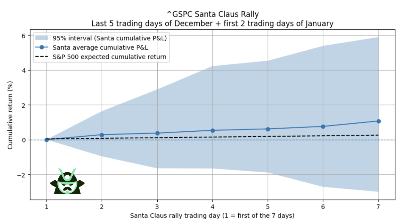
To see how wide the range actually is, the chart above plots the cumulative average together with a 75 percent confidence interval. Interestingly, you can see that it is indeed true that, on average, the S&P 500 performance during the Santa Rally period (blue line) is higher when compared to any other market phase (black line).
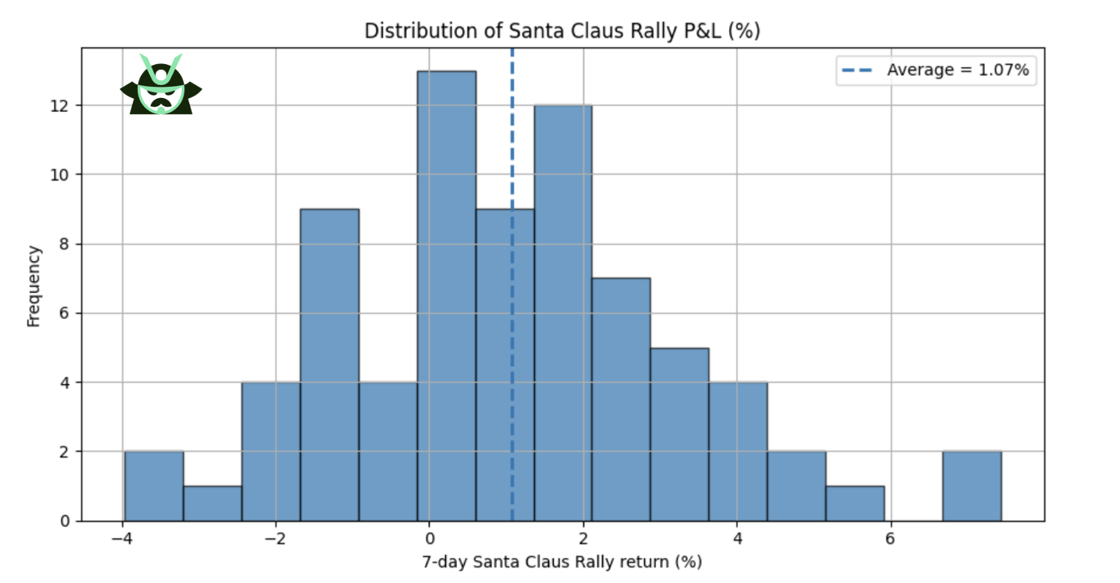
The second view above looks at the full distribution of outcomes. You can clearly see how there were lots of positive returns in the Santa period, confirming the average perspective we had from the previous chart.
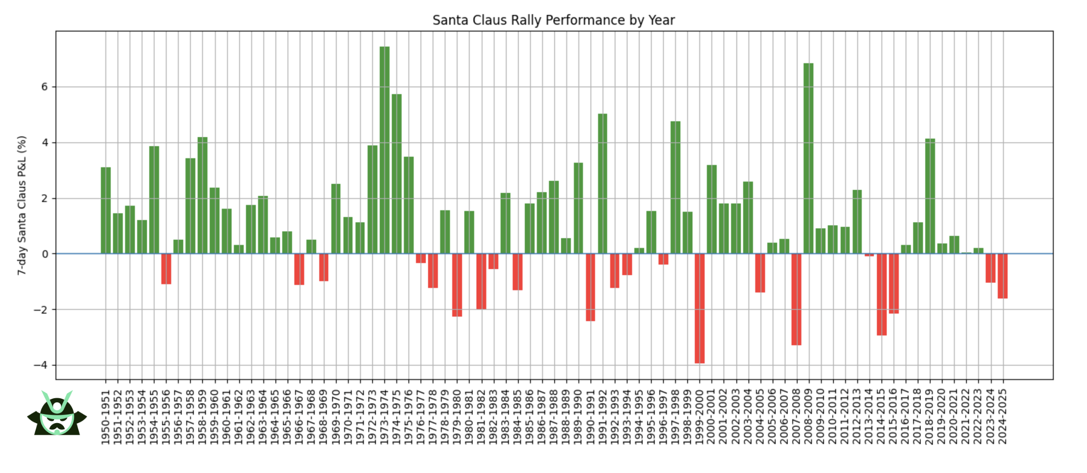
Going into further detail, as you can see from the chart right above, the year by year plot gives a feel for how mixed the result can be. Most decades show consistent gains, while some are more uneven, and a few years stand out with sharp moves in either direction.
Here are the key takeaways from this first analysis:
Insight | What the data shows | Why it matters |
Average Santa return is positive | Most years finish the 7 day window with gains | Confirms that the Santa Claus rally exists in long term data |
Results vary widely | The 75 percent interval ranges from about -3 percent to +6 percent | This is a high variance period, not a stable seasonal edge |
Some years are extreme | Year by year bars show sharp positive and negative outliers | Santa gains are far from guaranteed, even in strong decades |
Year to date performance vs Santa Claus rally performance
The next question is whether the tone of the year influences what happens during the Santa Claus rally. If a year was strong or weak, do those gains or losses spill into the last 7 trading days of the period? The backtest shows a relationship, but it is weak and not reliable enough to build a trade on. The scatter plot makes this clear:
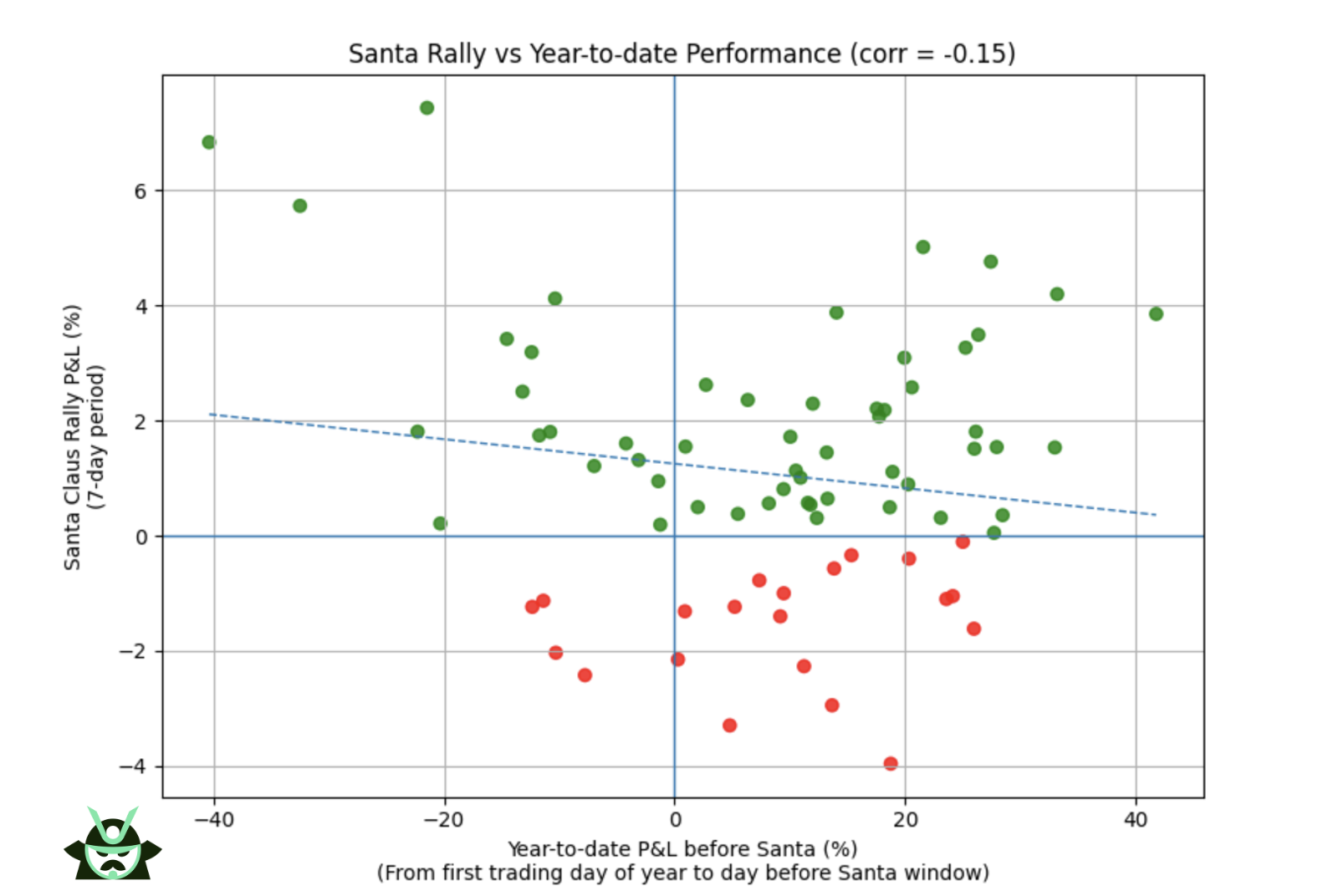
As you can see, there is a slight inverse correlation. This notion can give you a nice edge in this time of the year (for instance, you may use our screener for the options market while keeping in mind how the market has fared so far this year).
When the S&P 500 had a very bad year, the Santa window often delivered a sharp rebound. These rebounds are not small. Some of the most negative YTD periods finished with Santa rallies of several percentage points in a single week. This fits what many traders see during stressed markets: once selling pressure fades, short windows can snap back fast.
Positive YTD years can still show soft Santa periods, but the effect is much milder. Strong years do not guarantee strong finishes. They often end with quiet or slightly negative Santa returns, which is consistent with stretched markets taking a break.
So here is what you should keep in mind about the YTD performance vs Santa Claus Rally P&L:
Insight | What the data shows | Why it matters |
Weak inverse correlation | Bad YTD years often end with strong Santa rallies | Helps explain why stressed markets can snap back quickly in late December |
Strong years do not finish strong | Positive YTD periods frequently show soft or flat Santa returns | Prevents traders from assuming momentum will continue into year end |
Signal is too weak to trade on | The slope is small and outcomes vary widely | Useful context, but not reliable enough for directional bets |
VIX level before the Santa Claus rally
Volatility often shapes short-term moves, so it makes sense to check whether elevated fear levels change the odds during the Santa Claus rally. To test this, the backtest pulled the VIX reading from the last trading day before the 7 day window begins. The goal was simple: see if higher implied volatility leads to bigger rebounds or deeper drops.
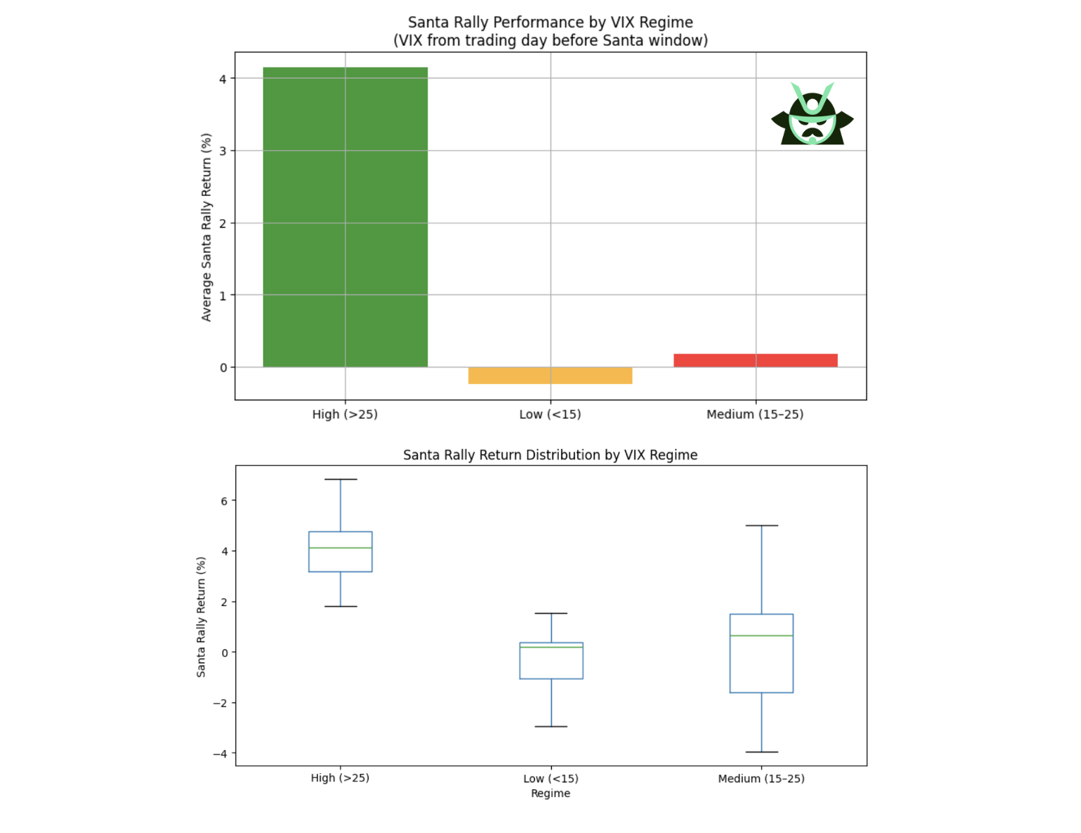
The results above show a clear pattern on the extremes. When the VIX sits above 25, the Santa Claus rally tends to be strong, which fits the idea of mean reversion after stress. When the VIX is below 15, the average return slips slightly negative, suggesting the market may already be priced for calm. The messy part sits between 15 and 25, where outcomes scatter everywhere and no clean structure appears.
A few quick points make the takeaway easier to use:
Insight | What the data shows | Why it matters |
High VIX supports stronger Santa rallies | VIX above 25 often leads to sharp positive moves | Fits typical mean reversion after stressed markets |
Low VIX tilts slightly negative | VIX below 15 shows weak or mildly negative Santa returns | Calm conditions offer less upside potential |
Mid range VIX has no signal | VIX between 15 and 25 produces chaotic outcomes | Useful for context, but not a forecasting tool |
Does the Santa Claus rally help predict the following year?
A common claim is that a failed Santa Claus rally signals weakness for the next year. To test this, the backtest split every season into two groups, positive or negative, then compared the full year S&P 500 return that followed each one. The result is simple: there is no meaningful difference between the two groups.
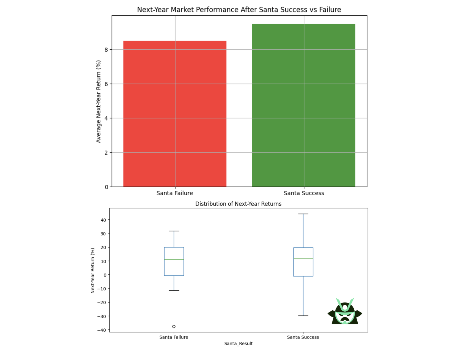
As you can see above, both “Santa success” and “Santa failure” years produced wide and overlapping ranges of outcomes, from strong gains to sharp drawdowns. In other words, a negative Santa period does not lock in a bad year ahead, and a positive one does not guarantee strength.
So, keep this in mind:
Insight | What the data shows | Why it matters |
No predictive power | Positive and negative Santa periods lead to similar next year returns | A Santa Claus rally does not signal future market direction |
Wide outcome range | Both groups include strong gains and sharp drawdowns | Market behavior in January to December is driven by different forces |
The effect is self-contained | The pattern stays inside its 7 day window | Traders should not use Santa performance for yearly forecasts |
Running the Santa Claus rally analysis on individual tickers
The same backtest used on the S&P 500 can be applied to any ticker, which is why at the bottom of this article you will find a free file that lets you run the Santa Claus rally study on your own tickers. Once you start testing single names, you quickly see that not all stocks follow the index level behavior.
Take MRK as an example. Its results almost flip the S&P 500 pattern. In the index, weak YTD periods often led to strong Santa rallies. In MRK, strong YTD performance generally paired with strong Santa periods, and weak years stayed weak.
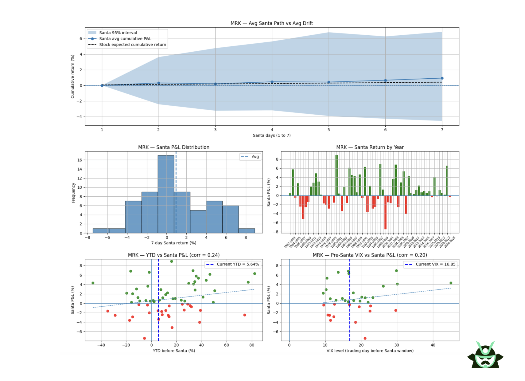
This fits the typical behavior of defensive health care stocks. They tend to hold up well when the market is under pressure, so they do not show the same “catch up” moves you see in riskier sectors at year end. The Santa Claus rally is still present, but it responds more to the stock’s own trend than to broad market stress.
As you can see, while it’s interesting to see the whole study on the overall market, it makes perfect sense to rerun this analysis, because:
- Ticker level patterns can differ sharply from the index
- Sector traits matter, especially for defensive names
- Running the test across multiple stocks shows which ones behave consistently
Read More
Perform your own backtest with our free Colab file
AUTHOR
 Gianluca LonginottiFinance Writer - Traders Education
Gianluca Longinotti is an experienced trader, advisor, and financial analyst with over a decade of professional experience in the banking sector, trading, and investment services.
REVIEWER
 Leav GravesCEO
Leav Graves is the founder and CEO of Option Samurai and a licensed investment professional with over 19 years of trading experience, including working professionally through the 2008 financial crisis.